Interior Design and Three-Dimensional Color
Color is probably the most powerful tool designers possess in designing spaces. The aura of an interior is so malleable by the placement and amount of color in the forms of paint, fabrics, and materials selected for design. It is my love and my specialty. We can affect the perception of size and proportion by the choice and position of color. And one of the most important concepts to remember is that colors interact with one another. Each selection is relative to one another. Check out our project image below.
In order to do an exceptional job of choosing a palette for architecture and interiors, it is important to know a bit of color theory. The study of color usually includes some technical issues that are troublesome for some, such as physics and color attributes, color systems and wheels, additive and subtractive systems, and computer color gamuts such as RGB and CMYK.
None of that information addresses the phenomenon of relative color or color interaction. So, we are going to skip the complicated stuff and move right into some simpler ideas. I’ll start with some basics. In art and design we start with a “standard” set of colors – red, orange, yellow, green, blue, and violet with multitudes of in-between colors. Knowing how to combine these many hues is what sets discerning interior designers apart. So, we begin in the field of art.
The appearance of color may change radically throughout the day, morning to evening, and these changes are often subtle and not very noticeable as they change. Master painters such as Claude Monet, studied this as he painted the same subjects at different times of the day. Some paintings feel cool and quiet and others warm and exciting to view. This conjures the idea that some hues are warm and others cool.
Red, yellow, and orange are warm and activating while the opposite hues, green, violet, and blue are soothing and calming. This knowledge can be used to great advantage in interiors. These two groups of colors also contrast with each other which can dramatically stimulate a 3D environment. To make matters even more complex, colors can react and change when placed next to each other. What’s a person to do?
Relationships between a colors position on a standard color wheel are a key factor. Colors directly opposite one another have the highest degree of contrast. Colors near to each other have lower levels of contrast. Knowing this helps. And knowing whether you want a calming or exciting atmosphere helps you determine the right colors and how much of each color you prefer to use.
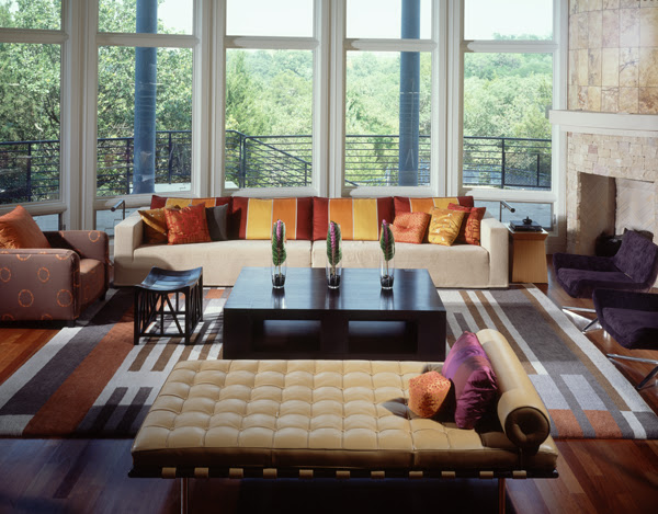
Monochromatic and analogous relationships, according to palette theory, are most soothing. As you can see in one of my projects below, mostly warm colors dominate the composition and you may find it harmonious. Many of the hues fall in the family of beige, brown, red, yellow, and orange. There is still a sense of some contrast through value contrast; dark and light balancing.
The exterior and the blue columns seem to recede into the background while the warm hues seem to advance toward you. You will also find this happening in paintings by artists such a Cezanne. This composition tends to keep your eyes focused on the interior, the near, but soon you will notice the cool of nature and may be enticed to walk outside. Stay tuned for future posts about color and how to use it to achieve the effect you desire. I plan to continue the series about the power of color.


Comments
Post a Comment